Jul
31
Some Thoughts on Composition
Filed Under Photography on July 31, 2010 at 4:02 pm
Initially I’d started writing these thoughts up as bullet points to use as show-notes for this weekend’s Chit Chat Across the Pond segment on the NosillaCast, but as I worked on them I realised they were worth developing into a full blog post. The aim here is to share some of my thoughts on composing photos. A lot of people think that the difference between a snapshot and a professional looking photo is the camera, which is true to some extent, but a much more important factor is the composition. I believe that the single most important thing you can do to improve your photography is to work on your composition. Thankfully, a little effort goes a long way, so it’s time very well spent.
Sadly there are no hard and fast rules. It’s not the case that you can just learn 5 rules and then you’re Ansel Adams. If there are no rules, then what are there? Well, there are guidelines, tips, and some things to think about before you hit the shutter. For those who insist on thinking in terms of hard and fast rules, there’s only one rule, there are no rules!
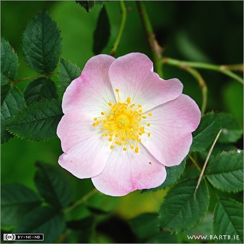
I think everyone’s default behaviour when taking photos is to put the subject in the very centre of the frame. That’s probably the single most important reflex you’ll need to change. There are times when a perfectly centred composition works fantastically well, but those are the exceptions. Generally speaking, centred subjects look boring and unimaginative. In fact, they look like snapshots. Pretty much the entire rest of this post will be about how you compose things when you don’t put the subject front and centre. But, before we do that, what about those exceptions? I think the biggest exception is when you have a symmetric subject. A face-down shot of a round flower cropped to a square with the flower dead centre can be stunning, see the example below.
Before we really get stuck in I just want to take a moment to think about what it is that we’re trying to achieve here. The aim of all these tips and guidelines is to create photos that are pleasing to the eye. You want to make the subject stand out, look it’s best, draw the eye, and feel comfortable and natural within the frame. Ultimately, if a photo feels cramped or unbalanced, it’s not going to be natural or pleasing to the eye. If the edge of the frame is too close to the subject, or bisects something in an uncomfortable way, it’s not going to feel right. This again leads to an obvious caveat, if you want to make a picture that evokes emotions of discomfort or tension, then you should invert these guidelines, and strive to do the very opposite!
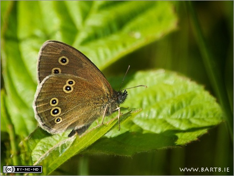
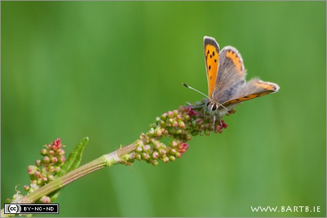
Lets start with what I think is the most common mistake I see – not giving subjects room to look or move into. If you make a photo of anything that has eyes, or even has anything remotely like a face, it needs room to look into. This goes for people, animals, insects, birds, even flowers! Unless these things are staring directly at you from the very centre of the frame, there should be more space in the direction they are looking than in the opposite direction. If they are looking just a little to the left, frame them just a little to the right, if they are looking a lot to the left, frame them a lot to the right. Again, it’s about balance. The image below is a good example of this, notice how close the back of the butterfly is to the frame on the left, compared to how far away the face is from the frame on the right.
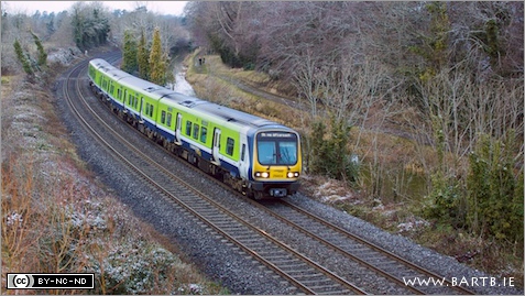
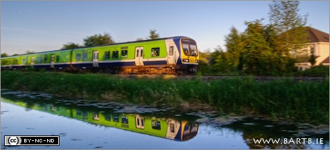
As important as it is to have room for things to ‘look’ into, it’s even more important to give moving things room to move into. You see a lot of people forget to do this with railway photography, and it makes the shot feel cramped and unnatural. Trains need space to move into, as do cars, people walking, birds flying, animals running, people on bicycles etc.. If it moves, give it room to move into. The example below is of a train, if the crop were to fall close to the nose of the train it just wouldn’t work.
Probably the most famous guideline in photography is the so-called “rule of thirds”. You often see this as an overlay in image editing software and even in some camera viewfinders. You simply imagine drawing horizontal lines one third of the way up and one third of the way down, and vertical lines one third in from the left and one third in from the right. This gives you a grid of rectangles. The most powerful places to have elements in your shot is along the lines for long elements, or at one of the four intersection points for smaller items in the frame.
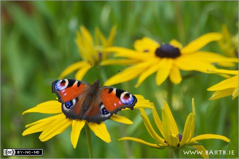
The example blow shows placing the main subject, the butterfly, on one of the intersections of the rule of thirds grid (and giving it room to look into):
And this second example shows a vertical element in the shot, in this case the bird’s body, being placed along the rule of thirds line. What you’ll also notice is that the head is at one of the crossing points, and again, the bird has plenty of room to look into:
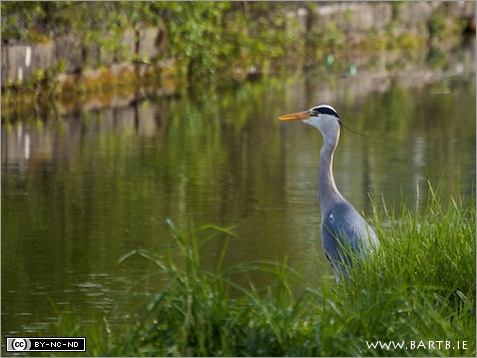
It’s also common to place the horizon in your shots along one of the two horizontal rule of third lines.
Don’t feel you HAVE to be bound by the rule of thirds though. It can make for some stunning compositions, but it’s not even nearly the case that all well composed shots follow the rule of thirds.
Don’t be afraid to edit your composition in post, and don’t feel bound by the aspect ratio of your camera. If you want to crop to enhance the composition, do it! My camera has only one cross-shaped auto-focus point, so when I shoot macros, I make sure to centre that one autofocus point right over the part of the subject that must be in focus. This leads to a sharp image with a boring composition, the simple solution is to crop it to a stronger composition. I often shoot with the express intention of cropping to a square or to a strongly panoramic aspect ratio. Empty space is often as important as the subject in a strong composition, but empty space in the wrong place is a distraction, so crop ruthlessly to get rid of it! For moving trains I often find a panoramic aspect ratio really helps to give a sense of speed, like in the shot below:
Something else that can really help compositions is the inclusion of a strong diagonal element. For some reason our eyes seem to really like diagonals. The example below uses a strong diagonal element in the composition by having the branch the butterfly is sitting on exit the frame right in the corner. At this stage you should also notice that the butterfly is at one of the magic rule of thirds points, and that it has plenty of room to look into.
Now I want to change track completely, and move to the very difficult challenge of getting good photos of places. This is really hard, because the places we want to capture are very three-dimensional, and our eyes see that thanks to our binocular vision. The camera however only has one ‘eye’, so it flattens the scenes it captures. Not taking this flattening into account is probably the biggest cause of boring photos of places.
Before moving on to matters strictly compositional, I want to also remind you to be very careful of mergers and intruders. Mergers happen when you have two things behind each other that shouldn’t be. We don’t naturally notice them because we see in stereo, but like I said, the camera doesn’t. We’ve all seen examples of this, people with trees or signs spouting out of their heads and so forth. Be careful how you place things at different distances into your composition, so that nothing or no one sprouts any un-wanted appendages! As for intruders, these are things poking into the frame you don’t want, like a stray tree branch, or the edge of a road sign etc.. Take a moment before pressing the shutter to check that there’s no unwanted distractions at the edges of your frame.
Now – how do we get a sense of depth into our shots of places? Ultimately it’s generally about layers. You need multiple layers to get a sense of depth. The more the better, but be sure to try get at least three. To get a good shot of a landscape or a place you need something of interest in the foreground, something of interest in the mid-ground, and something of interest in the background. That’ll give you a sense of depth. In general, the actual landscape or garden or building will be the mid-ground. If you’re lucky to have some nice clouds then you get the background for free too. What usually takes the most work, is finding an interesting foreground.
The example below shows four layers. In the foreground we have the tree, in the mid-ground we have the field, in the background we have the castle, and the 4th layer comes from the spectacular sky:
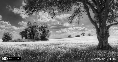
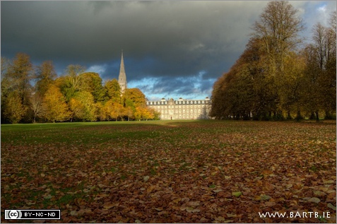
When it comes to the foreground you can get quite imaginative. There are all the obvious things like rocks, trees, flowers or fences, but there are other things you can do too. Simply having a tree branch or something else frame one or two of the edges of your shots can work really well as a foreground. Another great option is to get down low and use the texture of the ground as your interesting foreground. In the case of the example below, the leaves make for a nice foreground, the building an interesting mid-ground, and the dramatic sky a good background.
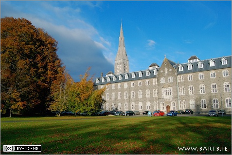
You can even use something as simple as the shapes of shadows to add some interest to the foreground, as shown in the image below:
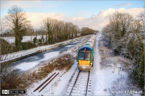
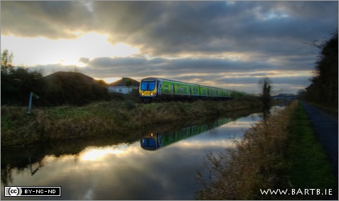
If you can’t get layers, strong lines heading to a vanishing point can work very well, but you’ll only get that opportunity sometimes. You should of course grab it when you can, but you can’t rely on always having that option. The example below uses the parallel converging lines formed by the canal, the path, the railway line and the train to give a very strong sense of depth (also notice where the vanishing point is – on one of the magic Rule of Thirds points):
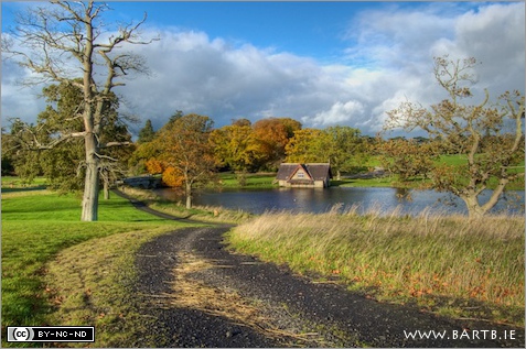
If you can’t get long straight converging lines, a gently winding path can serve the very same function, as shown below:
Finally, I just want to end with another very simple tip, with one very notable exception, avoid putting the horizon dead-centre in your shot. The rule of thirds lines are often ideal, but you don’t have to go that far, just get it a little off centre. What’s the caveat? When you’re shooting a reflection, getting the horizon absolutely dead centre often works fantastically well.
.


Awesome article, Bart. Thanks for the great explanation and the stunning photos to illustrate it. I’m looking forward to hearing CCATP on the Nosillacast this week!
Bart,
Great post. Thanks for sharing this. I’m trying to improve my composition and i think this will help.
Chris
Hey Bart,
thanks for sharing your thoughts on the matter of composition. There are a few things I have not considered yet / been doing only subconsciously, so this is a really great help, I think.
Always nice to read another great writeup of yours about photography.
By the way… there are some really nice shots used as examples here, I think they do their purpose justice and more.
Kind Regards
Martin
I wish I’d been able to hear your composition discussion before I went on holiday last month. I hadn’t consciously thought about the layering concept before, though I am a fan of natural framing and low angles.
Here’s a very deliberate framing of a view with foreground items – a place where I’d really love to retire to!
http://www.flickr.com/photos/zkarj/4795347993/in/set-72157624498509738/
And another from a nearby location (different lake) that throws in a diagonal as well.
http://www.flickr.com/photos/zkarj/4795363295/in/set-72157624498509738/
Thanks folks!
Allister – I can see why you’d want to retire there, it looks wonderful! Also, the framing works very well in those shots.
Bart.
[…] Bonus – Thinking about composition. […]
[…] I posted some of my thoughts on Photographic composition, and used that post as the basis for a conversation with Allison on episode 271 of the Nosillacast […]
click the up coming webpage
Some Thoughts on Composition : Bart Busschots