Jan
24
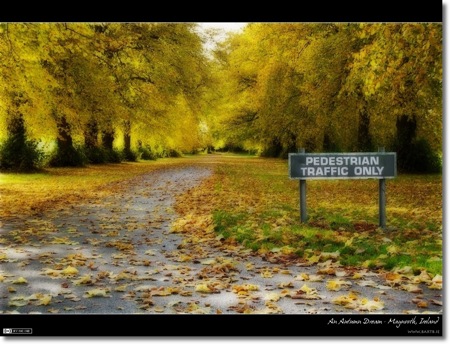
Photo of the Week 101 – An Autumn Dream
Filed Under Photography on January 24, 2010 at 9:39 pm
Since I started playing with the Orton effect around Christmas time I’ve been going back through some of my older shots looking for images that would go well with the effect. Of all the images I played with, this one is my favourite. For some reason the dream-like quality of the Orton Effect compliments the autumnal tones very well. If you’re interested in experimenting with the Orton Effect I posted a tutorial with screen cast a few weeks ago.
- Camera: Nikon D40
- Lens: Nikon DX AFS 18-55mm (D40 kit lens)
- Exposure: 1/60 sec
- Focal Length: 42mm
- Focal Ratio: f/8
- ISO: 200
- Camera Mode: Aperture Priority
- Exposure Bias: -0.7ev
- Processing: The Image was first tweaked a little using Aperture’s Dodge & Burn plugin, and then the Orton Effect was applied.


All I can say is: “What a lovely shot!”.
Gorgeous. but I’m undecided about the sign.
I suggest you go back – pull out the sign – re-take the photo – put the sign back – work your magic – post the result so I can compare.
🙂 🙂 🙂
Ditto to both of the above comments. But perhaps more practically, what happens if you mask out the sign from the Orton effect and leave it sharp? The thing that bothers me is the ‘smudging’ effect on the face of the sign.
Oh this is gorgeous. I just love the autumn colors. And cool Orton effect. Those trees are lovely.
I don’t like the sign though. It does add a bit of abnormality to the shot, but I think with the Orton effect, it doesn’t go.
wow, I do love those trees though
Thanks for all the comments everyone, I appreciate the honesty very much.
But, I have to say, I’m surprised at people’s strong dislike of the sign. I’ll be honest, the only reason the shot was taken at all was because the sign was there! For me, it’s what makes the shot. Just a row of trees didn’t seem interesting to me, even if they were pretty and yellow. Always interesting to see how tastes vary.
Bart.