Nov
8
Photo of the Week 89 & 90 – Steam Loco No. 186
Filed Under Photography on November 8, 2009 at 4:59 pm
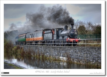
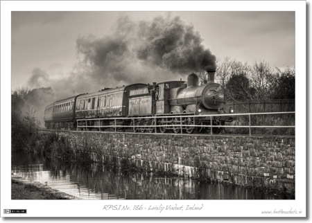
Since I was ill last weekend I’m doing a double-post this weekend. In this case, it’s actually the same shot post-processed in two different ways.
Both shots are of the steam locomotive No. 186 which started it’s life as a mainline locomotive for Ireland’s Great Southern & Western Railway (GS&WR or just GSWR). No. 186 is now lovingly maintained by the Railway Preservation Society of Ireland (RPSI), and gets to stretch it’s legs on various Irish Rail mainlines on steam specials. This shot was taken when No. 186 was pulling the Ghost Train steam special from Dublin Connolly to Mullingar and back to Dublin Connolly. Here we see No. 186 crossing the Leixlip Viaduct on her way out to Mullingar in the morning. You can read more about No. 186 on the RPSI’s Website.
Normally when I tone-map shots I like to keep them looking natural, but in this case I really liked the result of pushing things a little further. The result is still quite natural, but yet also somewhat hyper-real.
The second version uses the first as the base for the conversion to monochrome. Because black and white shots tend to pick up a lot of texture anyway, the hyper-real look of the first version is completely lost in the second. We’re used to Sepia tone shots having this level of texture and detail in them.
You can see all my photos from this steam special in this Flickr Set.
- Camera: Nikon D40
- Lens: Nikon DX AFS 55-200mm
- Exposure: 1/320 sec
- Focal Length: 55mm
- Focal Ratio: f/4.5
- ISO: 400
- Camera Mode: Aperture Priority
- Processing (Version 1): Started by tonemapping a single RAW image in Photomatix Pro, then selectively tweaked the exposure, contrast, and saturation using the Dodge & Burn plugin in Aperture.
- Processing (Version 2): Took the veresion described above as the starting point, then converted to monochrome using the Channel Mixer brick in Apeture, then added a subtle Sepia Tone using the Colour Monochrome brick.


That black and white photo is legend. Colour loses the emotion.
These two photos elicit very different emotions and thoughts. The black and white to me looks like I’m looking back in time, but the color one makes me feel that I’m seeing a painting. the color one also brings out more detail – like you can’t even tell there’s an engineer waving out of the door, even after you know he’s there. I like the level to which you pushed the tone mapping – not quite unrealistic but again makes me think of a painting…almost.
I like the color photo…it’s got an antique-ish look to it.
Finally got around to taking a look at this one. I agree with Allison. It looks almost like a painting. It’s something to do with all the different shades of grey in there and perhaps the muted colours on the carriages.
In any case, it’s a stunning result Bart. Well done!