Apr
20
Photo of the Week 9 – The Light of Christ
Filed Under Photography on April 20, 2008 at 3:38 pm
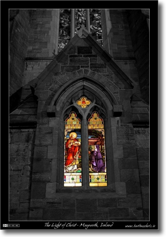
No, I haven’t had some sort of epiphany, I’m still every bit as agnostic as ever, however, I think the title fits the photograph perfectly. I took this image months ago but was never quite happy with it until yesterday. So what’s changed? I converted the image to partially black & white using the technique I described yesterday. I had a hunch this image would work well partially mono-chormoed but my jaw still dropped when I saw the result. It went from a picture with promise to one of my very favourite photos.
The image is of one of the stained glass windows on the back of the Gunne Chapel on the campus of St. Patrick’s College in Maynooth, Ireland. I took it shortly before Christmas last year.
For those of you interested in such things here are some of the technical details of the shot:
- Camera: Nikon D40
- Lens: Sigma EX 30mm 1:1.4 DC HSM
- Exposure: 1/15 Sec
- Focal Length: 30mm
- Focal Ratio: F1.4
- ISO: 800
- Camera Mode: Aperture Priority
- Exposure Compensation: -1.0
- Post Processing: Partially converted to black & white with the GIMP.
Updated (21 April 2008): At the request of Paul in the comments I’ve tilt-shifted this shot too. Personally I’m not over-joyed with the results. You can find the tilt-shifted version here.
[tags]Photography, partial black & white, stained glass, Maynooth, Ireland[/tags]


Tilt shift for the window would probably ace the shot.
I’m trying to figure out whether or not you’re being serious Paul …. are you?
Yes I’m being serious. You’ve been advocating tilt shift all month and I liked it. More for the “place emphasis on something” thing I read about on its wiki page.
There ya go Paul, added a link to a tilt-shifted version into the post. Personally I prefer the non-tilt-shifted version because of the detail in the brickwork. Which do you prefer?
Bart.
I reckon having that window above ruins the whole photo in both versions.
Short of re-modeling the chapel there’s not much I can do about that other window. I want the shot to contain the whole facade of the windows I shot right up to the point so there’s not much cropping I can do really. I could crop it to just the window but that would be a rather boring shot. It’s the contrast between the stark black & white of the brickwork and the warm colours of the glass that I really like.
Bart.
One, Picture is Fantastic! Really like it.
Two, the problem paul was saying about the upper picture, have you considered leaving that in colour as well. Now off the top of my head, i think that might take away from the picture, but well might be worth a try.
Three, is your Blog RSS’d, and if so whats the feed address?
once more, fantastic Picture
Cheers Gar!
I gave a lot of thought to what to do with the upper window but decided not to colour it in for two reasons. Firstly, it would distract from the real focus of the shot, and secondly, the colours were very dull on that window because there is no light source shining directly through it like with the lower window.
As for the RSS, it has always been present in the headers so your browser should be showing the RSS button in the address bar but to make things clearer I’ve added an RSS Feeds widget to the side bar. Thanks for pointing out that wee shortcoming.
Bart.
Having seen a lot of BW “conversions” (hmm – I like that!), I think this would look better if you only partially de-saturated the stonework. Otherwise it just looks like another of those “someone-who’s-just-found-out-about-masking-and-desaturating” type of picture. But a nice pic though.
Hi Paddy,
Thanks for the suggestion. The problem is that the stonework was lit with a ghastly sodium lamp so it had a terrible yellowy orange look. Basically, the stonework looked terrible in colour which I why I had a go at converting it to black & white.
I may have another go at it over the weekend and see what else I can do with it.
Thanks for the comment,
Bart.