Oct
27
My Very First Thoughts on Leopard
Filed Under Computers & Tech on October 27, 2007 at 5:55 pm
 My copy of OS X 10.5 Leopard arrived yesterday, so I spent the evening backing up, and then installing. I’m sure I’m going to be posting plenty more about the new cat over the coming weeks and months, but for now, I just want to give you my very first impressions. I have a number of Macs but I’ve only installed Leopard on one for now, that way I can be sure everything I need works before I install it on my Mac in work or the Mac I’m using for my PhD work. So, that means I’ve installed Leopard on my oldest and lowest-specked Mac, my fist generation G4 Mac Mini. This was one of the first Mac Minis to make it into the country so it’s not at all a new machine. It’s a G4 so it’s three processor architectures behind (64 bit Intel, 32 Bit Intel, and G5 PPC), it does however have 1GB of RAM because I was quite forward thinking when I bought it. By anyone’s standards this is an old machine, so, if Leopard runs well on it, it will run even better on modern machines.
[tags]OS X, Apple, Leopard[/tags]
The very very first thing I noticed was how cool the box is. It has a cool holographic effect and is literally very shiny. Apple also threw in some free Apple stickers which is nice, I was running low 🙂 Needless to say the box doesn’t matter in the grand scheme of things, but Apple’s attention to detail, even on something as simple as the box, does inspire confidence and give a great first impression.
OK, the real first thing I noticed was that the installer has been simplified. The OS X installer has never been particularly complicated and has always had a proper OS X GUI throughout the entire install. The Leopard installer is no exception. In fact, with its cool Aurora background the installer even looks cool! If you want you can customise the install but the only question you HAVE to answer is your choice of language. The installer looks after all the rest and with only the minimum of next-clicking. Previous OS X installers showed you loads of superfluous information while doing their magic, the Leopard installer does none of that. It just gives you a single progress bar and an estimated time to completion. Power users still have access to all the tools and options they had before but for everyone else the result is a much simpler, friendlier and less intimidating install.
When the installer finishes you are greeted with a new intro sequence. It still just says welcome in more languages than I can recognise but they’ve updated the graphics to keep with Leopard’s space theme. Sure, it’s just fluf, but I like it. Once the welcome sequence finishes you’re asked a few questions to finish the setup. I don’t remember the exact sequence of questions Tiger asked but I’m pretty sure Leopard has simplified things here too.
There had been rumours before Leopard’s final launch that Apple had seen sense and got rid of the stupid shelf-look when the Dock was not along the bottom of the screen. I was relieved to see that the rumours were true. When you move your Dock to the left or right you loose the stupid shelf and get a modernised version of the old Dock.
At this stage I’m still installing apps and tweaking things but already I’m pretty sure my crappy old G4 is running faster with Leopard than it did with Tiger. Try sticking Vista on a three year old machine and see how you get on 🙂 I also get ridiculous levels of shininess and transparencies etc with just 32MB of video RAM. This really makes we wonder how badly Vista has to be written to require so much video RAM to deliver the same level of polish.
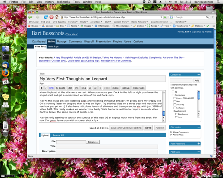
I’m only starting to scratch the surface of this new OS so expect to hear much more from me soon. For now I’m gonna leave you with a screen shot.


I’d be interested to hear about apps which don’t work or at least don’t wortk properly Bart. I’d heard SuperDuper and eye TV wern’t fully up to speed so I was holding back until they were…