May
21
Would Somebody Think of the Color Blind People!
Filed Under Computers & Tech, Software Development on May 21, 2007 at 1:34 pm
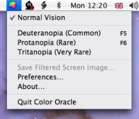
 If you design stuff please bear in mind that not all of us are blessed with perfect color vision. When you’re developing your color schemes please make sure they are still readable to the color bind. Don’t worry, it’s trivially easy to test this with a great free tool called Color Oracle. BTW, even if you don’t have an actual need for this tool it’s still fun to play with 🙂
What’s really nice about this tool is that it’s available for Mac, Linux and Windows so everyone can play! I’ve only tested the Mac version and it works like a charm. It adds a simple menu bar icon to select which kind of color blindness to simulate. When you select a scheme your screen colors change so simulate what a color blind person would see. I really like that the change is very temporary, just click the mouse of press a key and everything goes back to normal. You can also set up hot-keys so you can very quickly check your interface works for color blind people with just the press of a single button. There is no excuse now for developing an interface that color blind people can’t use!
[tags]color blindness, software, freeware, OS X, Windows, Linux[/tags]


Hmm, that’s a pretty cool looking tool alright, must keep it in mind.
Yes, you’re so right. But do you know of any user interface not usable because of a color vision deficiency? I would say, there aren’t that many you can find these days. The days of nasty color schemes are almost gone.
[…] Oracle review on my blog: bartbusschots.ie/blog Color Oracle Home Page: colororacle.cartography.ch […]