Sep
2
iPhoto 7 – A Closer Look
Filed Under Computers & Tech, Photography on September 2, 2007 at 6:16 pm
In a follow up to my initial thoughts on the new iLife I want to have a more detailed look at the new iPhoto now that I’ve had some time to really get to use it. Although my overall impression is that this version of iPhoto offers significant improvements over the previous version, it is not perfect. One part of my work flow has become less intuitive in one sense, yet more intuitive in another. There is also still one very annoying omission from iPhoto.
[tags]iLife, iPhoto, Apple[/tags]
Some Minor UI Grumbles
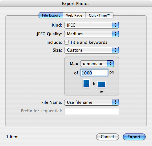
Lets Start with the not-so-good news before we move on to the good news. Firstly, my typical work flow involves exporting photos from iPhoto to add to my online gallery. I don’t want to export these photos at full-size, but rather at about 600x800px. In the old iPhoto it was very obvious how to do this, but when you were exporting multiple photos with different orientations the interface didn’t wake it very clear what it would do. As it happens it seems it kept all the aspect ratios intact and forced all images to fit inside a square box dictated by the largest specified dimension. This is what I wanted it to do but the interface element was not clear. The new iPhoto makes it much clearer what it will do, only asking you to enter one number, the ‘maximum dimension’. However, by default the controls for this feature are disabled and hidden. For a while I thought the feature had been removed! It had of course not been removed, but actually improved. The un-intuitive bit was that you have to explicitly specify a file format (or ‘Kind’) and then choose a size of ‘custom’ before you can enter this maximum dimension. The screen shots below show you the default state of the dialog box and the way you have to set it to choose the size you want to export your photos at.


The UI has one other glitch in it’s behavior in my view, the way the full-screen button behaves. The fact that you can now zoom a photo without going into edit mode is generally a good thing. However, there is one problem with it’s implementation. You would expect that if you had a photo enlarged and then clicked on the button to go to full-screen mode that you would enter full screen mode with that picture as your current image. But that’s not what happens. Instead the image is un-zoomed and you return to the thumbnail view. WTF!?
One Missing Feature
Finally, before we get on to the good stuff I just want to mention one feature that iPhoto is still sadly lacking, geo tagging. I really want the ability to geo tag my images within iPhoto. Ideally iPhoto should use some Google Earth APIs to allow easy location of the places where your images were taken. Then iPhoto should stick the relevant GPS meta data tags into the image headers and keep them there when you export your images. There should also be a tie-in between iPhoto and Google Earth so you could easily see your images in their correct places all over the globe. Considering the close relationship between Google and Apple I really don’t think this is too much to ask for.
The Good
Now lets have a look at the good things about the new iPhoto. Firstly, I can confirm that all the new features that I thought were good in my initial thoughts are all as good as I’d hopped. The improved import feature really works and works well, the improved tagging interface is pretty much perfect, and events really do work. So, in summary, Steve wasn’t talking crap at his keynote, these features really do rock. However, the new feature that grabbed me the most is one Steve barely mentioned. He simply made a short throw-away comment about ‘great new editing features’ and moved on. He never elaborated. Personally, I think he should have because Apple have really improved things here.
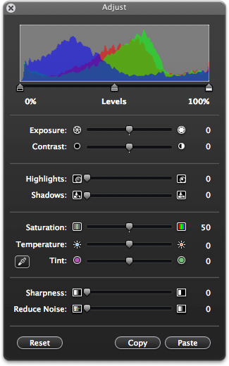
When you think about iPhoto’s function surely image editing is right up there at the top of the list! From what I can see each and every image editing tool has been improved. The Cropping tool now lets you more easily constrain the shape of the area you’re cropping. The red eye removal tool now lets you specify the size of the area you want it to operate on. Straightening has been moved from a slider in the ‘Adjust’ tool to a tool of it’s own and very very well implemented. The effects tool now has little counters under each effect so you can see how many times it’s been applied and also left and right arrows to change the amount of applications easily. However, for me the most impressive changes are in the ‘Adjust’ tool. This used to contain lots and lots of sliders that mostly did very low-level things and were generally quite un-rewarding to play with unless you really knew what you were at. You now have fewer sliders but they do much more powerful things and are a lot more rewarding to play with. The image below shows the range of sliders now at your disposal.

From my experience over the last week or so the two I used most were those for adjusting the exposure time and lightening the shadows in your image. When you have to take images into the sun or into a very bright sky these two sliders in combination will make for dramatic improvements as the ‘before’ and ‘after’ images below should show.

Original

Processed
There are a number of other subtle but very nice changes to the editing interface. At any stage while editing you see your image as it was before editing by holding down the shift key. Often when you’re editing a particularly difficult image you may start to wonder whether you’re making any progress at all, now you can see your progress with a simple stroke of a key! The interface also remembers your changes when you edit. In the previous version of iPhoto when you committed your changes they were saved to the image so that the next time you edited it all the settings were back to their default values. If, for example, you had adjusted the exposure time your image would still look like it did when you finished last time but if you went to re-edit it the exposure slider would be back in the center. Now, the sliders remember their place so it’s trivial to un-do a single change where as before your only way to undo changes was to revert to the original image and loose all your changes.
In summary, the new iPhoto is not perfect, but it is a massive improvement over the previous version. Using it is a whole new experience and such an improvement that, for me, iPhoto alone is worth the price of the new iLife suite.


[…] car with Honda bob’s help at hdabob.com/Charging.htm, Bart’s review of iPhoto 7 at bartbusschots.ie, SongTapper from songtapper.com, Mahalo Follow doesn’t pan […]
I enjoy listening to your audio clips from the Nosillacast. I especially enjoyed this one, as I am torn between upgrading to iPhoto 08 or perhaps finding a more robust photo editor.
Thank you very much!
Hi Debbie, thanks for your kind comments. If the old iPhoto is dramatically under-powered for your needs then they new one will be too. Sure, it is better, it has better editing and better photo management, but it’s still iPhoto. It’s not a professional package, it’s a package aimed at home users.
Hope that helps,
Bart.
Did you notice that the RedEye removal tool is seriously flawed in iPhoto 7?
http://discussions.apple.com/thread.jspa?messageID=5979903
Hi John,
I don’t really use the redeye removal tool because I don’t like flash photography but I’ve heard a quite a few complains about it on podcasts and blogs.
I hope they’ll fix it in either a point release or in the next version.
Bart.
For some reason the UNDO feature is disabled. If I make a change to jpg, I do not have the option to undo it. Any idea how I can fix this??
Some of my original files have be ruined.
Hi Andy, iPhoto does non-destructive editing. Your original is not actually touched. When you apply any effect you can go back to the same menu where you added it and change the setting. If you just want to undo all your changes and not just your cropping or your adjustments or what ever then just right (control) click on the photo and select “revert to original”
Hope that helps.
Bart.