May
2
Three 2.0s of Note
Filed Under Computers & Tech on May 2, 2007 at 12:51 am
This seems to be the time of year for 2.0 releases. Three pieces of software I use on a daily basis have gotten their big 2.0 update recently. Mozilla Thunderbird, the dashboard widget Pakze, and the iStat family of tools from iSlayer. (I discussed both Pakze and iStat in my post on Dashboard widgets for Techies.) In all three cases the most obvious change is a new coat of proverbial paint. Thunderbird and iStat in particular have really benefited from the addition of a little more polish to their interfaces. However, there is more to these upgrades than just looks.
[tags]Mozilla, Thunderbird, iStat, Pakze, Dashboard, Widget[/tags]
Thunderbird
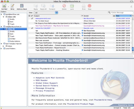
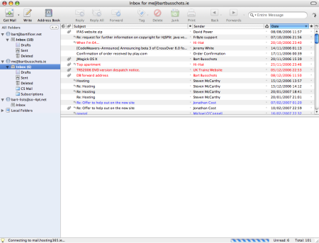
On the Mac Thunderbird has always stood out for it’s very plain almost all white interface. When surrounded by all those shinny Mac apps it really did look very out of place. The changes to the interface are all subtle, but they really work. A little more shine here, a pastel blue background there and some prettier icons and the ugly duckling has very much matured into a swan! The nice thing is that nothing has been taken away from the interface. All the elements you have come to know and expect are there, but there are a few new elements add in as a bonus. The Screen shots below show a before (Thunderbird 1.5) and an after (Thunderbird 2.o) view.

Before (Thunderbird 1.5)

After (Thunderbird 2.0)
For me personally the biggest change is the improved support for tagging emails. In the past each email could only have one tag (though they weren’t called tags), now each email can have as many as you want and you can even make up your own tags. When you think about it this is very logical. You used to be able to mark emails as Important, To Do, Later, Work, or Personal. But what if you had an important personal to do? Thunderbird 1.* made you choose which one tag to apply, now you can apply them all! As described in a previous post, I use tagging a lot, particularly in conjunction with smart folders (or saved searches in Thunderbird speak) to make things like to do lists so this one feature alone makes the update worth it for me.
The only other two changes I’ve noticed are all about navigation. You now have the choice of a four views for the sidebar with your folders in it: All Folders (the old view), Unread Folders (actually useful), Favorite Folders (not sure if this is any use), and Recent Folders (might be of some use). You cycle through the views using two arrows on the top of the side bar. Finally, the interface now provides web-browser-like back and forward buttons so you can easily get back to the the last mail you were looking at or the last folder you had navigated to. Both these new features may become very useful in the future. However, people don’t expect these features to be in their mail client so they will probably go mostly unused because people won’t notice they’re there!
The iStat Tools
Again, the most notable change is the new look and feel. The new interface for iStat Nano takes some getting used to but it does work well and seems to be a more efficient use of space than the old one. The only small complaint I have is that the interface is now almost monochrome, being almost pure black and white. The old bright blue interface was tacky and rather lacking in style so I can see why they toned it down, I just think they may have toned it down too much!
Other than that we have the usual changes for iStat releases, more support for more sensors on more systems! For example, I can now see the speed of both of the fans in my MacBook Pro. However, the biggest news is that there is now a new member of the iStat family. In the past we had the nice compact iStat Nano dashboard widget, and the large iStat Pro dashboard widget which gave you more info than you were ever likely to need. Now we also have the iStat Application. Yes, iStat has left the dashboard! If you thought iStat Pro was information over-load, just wait till you get a load of the iStat App!
Pakze
Along with iStat Nano and the weather widget Pakze is one of the three widgets I install on every Mac I use. It does one thing very well, it shows you what your machine is up to on the network, showing you what machines your computer is communicating with on what ports. I like to keep an eye on what my Mac does on the network. I know there is no real spyware problem on the Mac at the moment, but if one ever develops I’d like to think I’d spot it with this widget.
Again, the display has been tweaked a bit but in this case the tweaks are all about making room for the two major new features. Firstly, there is now a third column so you can see how much data is being transfered as well as just who is communicating with you on what port. Secondly, when you click on an IP address the interface now expands to make room for the whois information for that IP. Adding whois information to this widget was a stroke of genius by the developers and that one feature alone would be enough to get me to upgrade.


